Data Visualization Service for Research, Theses, and Journals
A data visualization service turns your raw research data into clear, accurate, publication-quality figures. PhD analysts build journal-ready charts in ggplot2, Python, or GraphPad Prism and deliver editable source files so every figure stays reproducible.
ggplot2, Python, GraphPad PrismJournal figure specificationsEditable source files at handoff
Short answer
A data visualization service turns your raw research data into clear, accurate, publication-quality figures. PhD analysts build journal-ready charts in ggplot2, Python, or GraphPad Prism and deliver editable source files so every figure stays reproducible.
Free written quote
Scope, timeline, and price before you commit
Quote within a few hours
WhatsApp or email
ggplot2, Python, Prism
Vector PDF, EPS, TIFF at 300+ DPI
Colorblind-safe palettes
Journal figure specs met
Need publication-quality figures for your paper or thesis? Get a free quote and a PhD analyst will reply within a few hours with scope and timeline.
A data visualization service turns your raw research data into clear, accurate, publication-quality figures that reviewers and committees can read at a glance. At Research Gold, PhD analysts build scientific data visualization in ggplot2, Python, or GraphPad Prism, match every chart to the question it needs to answer, and hand back the editable source files so each figure stays reproducible long after delivery. Every project is matched with a specialist who knows your target journal's figure requirements, whether you work in health sciences, nursing, psychology, education, social sciences, and beyond.
Whether you are preparing a manuscript for a high-impact journal, a results chapter for your thesis, or figures for a grant application, the quality of your research data visualization shapes the first impression of your work. This page explains exactly what our data visualization services include, from chart design through scientific figure preparation for journal submission, which tools we use, how the process works, and the common figure mistakes we help you avoid.
Why Your Figures Decide Whether the Paper Gets Read
Editors and peer reviewers look at your figures before they read your methods. A cluttered, mislabeled, or low-resolution chart signals carelessness; a clean, well-designed one signals rigor. In many fields the figures are the only part of a paper that a busy reader studies in full, which is why data visualization for research papers is not cosmetic work but part of how your evidence is judged.
Good scientific data visualization does three things at once. It represents the underlying numbers honestly, with correct axes, error bars, and sample sizes. It directs attention to the finding that matters, instead of forcing the reader to hunt for it. And it meets the technical specifications of your target journal, from color mode to resolution to font embedding. Getting all three right under deadline pressure is where a dedicated service saves you days of frustration.
What Our Data Visualization Service Delivers
Our data visualization service covers the full path from a messy spreadsheet to a submission-ready figure pack:
Figure design and chart selection matched to your data type and research question
Publication-quality figures built in ggplot2, Python, or GraphPad Prism
Colorblind-safe palettes and journal-compliant fonts, sizes, and resolution
Vector formats (SVG, EPS, PDF) and 300+ dpi raster output (TIFF, PNG), matched to your journal figure guidelines and specifications
Editable source scripts or project files so figures remain fully reproducible
Figure legends drafted to sit alongside your manuscript text
Free redraws until your reviewers or committee accept the visuals
If your project also needs the analysis behind the figures, our data analysis service and biostatistics consulting services run the models and hand the results straight into the visualization step, so the numbers and the charts always agree.
Chart Types We Build
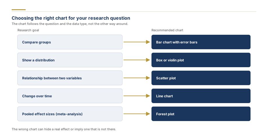
We produce the full range of static figures used in academic publishing. The table below maps common research questions to the chart that answers them.
The right tool depends on your field and your journal. We build in all three of the standards used across research:
R with ggplot2 is the workhorse for statistics-heavy fields. Its grammar-of-graphics approach produces precise, reproducible figures and is the default for most meta-analysis, epidemiology, and ecology work. You receive the full script, so any change is a one-line edit and re-export.
Python with matplotlib and seaborn suits computational and data-science-adjacent fields, and integrates cleanly with bioinformatics pipelines. We deliver the notebook or script alongside the figures.
GraphPad Prism remains the standard in many wet-lab and biomedical journals, where reviewers expect its familiar look. We hand back the Prism project file so your lab can reuse the template.
Because every figure ships with its editable source, your data visualization stays reproducible. If a reviewer asks for a different color, an added group, or a log scale, you are never stuck re-creating the chart from a flat image.
Our Figure Preparation Process
Figure brief. You share your dataset and your target journal or thesis guidelines. We confirm the chart types, the story each figure should tell, and the technical specifications.
Data check. We validate the data, recode or reshape it where needed, and choose the correct visual encoding for each variable so nothing is misrepresented.
Draft figures. We build first-pass visuals with colorblind-safe palettes and clean layout, then share them for your feedback.
Refinement. Labels, legends, annotations, axis breaks, and panel arrangement are polished to your journal's figure guidelines and, where relevant, broader conventions such as the APA Publication Manual, 7th edition, figure standards (American Psychological Association, 2020).
Handoff. You receive the vector and high-resolution files plus the editable source, so every figure is reproducible and easy to revise.
Common Figure Mistakes We Fix
Even strong studies are let down by avoidable visualization errors. The most frequent ones we correct include:
Rainbow and red-green palettes that fail for colorblind readers. We replace them with colorblind-safe schemes, such as those built on ColorBrewer color schemes for cartography and figures (Harrower and Brewer, 2003), that survive grayscale printing.
Truncated y-axes that exaggerate small differences and trigger reviewer suspicion.
Missing error bars or undefined error bars, where the figure never says whether the bars are standard deviation, standard error, or a confidence interval.
Low-resolution raster figures that pixelate in print. We deliver vector art or 300 DPI minimum.
Overplotted scatter plots where thousands of points become an unreadable blob; we use transparency, binning, or density estimation to recover the signal where the data supports it.
Inconsistent styling across panels and figures, which we standardize into a single visual system.
Scientific Figure Preparation for Journal Submission
A large share of our work is not building new charts but scientific figure preparation: taking figures that already exist and making them submission-ready for a specific journal. Author guidelines are precise about resolution, color mode, font embedding, panel labeling, column widths, and accepted file formats, and figures that miss them bounce back from the editorial office before review even starts. Send us your target journal and we handle the figure formatting end to end:
Sizing figures to the journal's column and page widths so nothing is rescaled and blurred in production
Converting color figures to the required color mode and checking they survive grayscale printing
Panel assembly and labeling (A, B, C) with consistent fonts and alignment across multi-panel figures
Rebuilding reviewer-rejected figures from your data or source files rather than patching flat images
Thesis and defense figure packs formatted to your institution's template
This is the same standard journals apply whether the figure started life in our hands or yours, so you can bring us a finished manuscript's figure set and submit with confidence.
Who We Build Figures For
Our research data visualization clients span every career stage. PhD and master's students use us to turn a results chapter into clean, defensible figures before a viva. Postdocs and principal investigators offload figure preparation under journal deadlines. Research teams standardize the look of an entire manuscript or grant. Across all of them, the goal is the same: figures that are accurate, persuasive, and accepted without a redraw request. We also produce the specialized figures behind sequencing studies, including volcano plots, heatmaps, and PCA projections, as part of our bioinformatics analysis service.
Every project is quoted as a fixed fee before work begins, based on the number of figures, the complexity of the underlying data, and your journal’s technical requirements. A short figure pack costs far less than a full analysis engagement, and redraws are free until your reviewers or committee accept the visuals. Send a short description of your data through the quote form and you will have an exact price, usually within minutes during working hours.
Yes. Tell us the target journal and we work directly from its author guidelines: resolution, color mode, fonts, file formats, and column widths. Figures are sized to the journal’s actual column dimensions so nothing is rescaled in production, and multi-panel figures are assembled and labeled to the journal’s convention. If the journal bounces a figure for a technical reason, we fix it at no charge.
Yes, this is one of the most common reasons researchers come to us. We rebuild the figure from your data or editable source rather than patching the flat image, correct the underlying problem, such as resolution, palette choice, or undefined error bars, and return both the corrected figure and the source file so the fix survives future revisions.
ChatGPT and other AI tools can draft chart code and suggest layouts, but they cannot verify that the figure correctly represents your data, that the statistics behind it are sound, or that it meets your journal’s figure specifications. A misread axis or mislabeled group can sink a paper at peer review. We use modern tooling to work quickly, but a PhD analyst checks that every figure is accurate and reproducible before it reaches you.
We deliver vector formats (PDF and EPS) for line art and high-resolution raster formats (TIFF or PNG at 300 DPI or higher) where journals require them, plus the editable source script or project file. That means you can request a change later and re-export the figure yourself without starting over.
Have your data ready but no time to fight with figure formatting? Send us your dataset and we will return journal-ready charts with editable source files.