A standard meta-analysis gives you a snapshot of all available evidence pooled at once. A cumulative meta-analysis gives you the entire timeline, showing how the pooled estimate changed as each new study was published. The difference is clinically and historically significant: it can reveal whether a treatment effect was already established decades before widespread adoption, or whether an initially promising result eroded as larger trials accumulated.
This guide explains how cumulative meta-analysis works, how to read the plot, and how to use it practically in your research. You can run one immediately using the Cumulative tab in our free forest plot creator.
How Cumulative Meta-Analysis Works
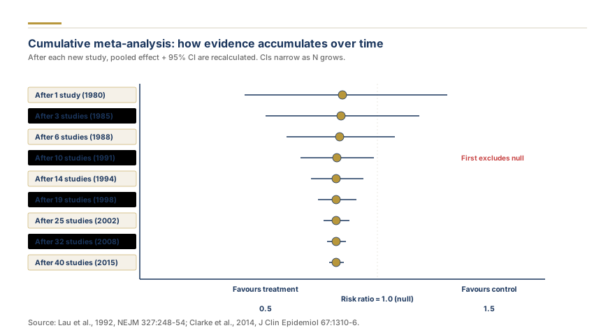
In a standard meta-analysis, all studies are pooled simultaneously and each study receives a weight based on its precision or sample size. In a cumulative meta-analysis, studies are sorted by a meaningful ordering variable, almost always publication year, and the meta-analysis is re-run sequentially.
The first row of the cumulative plot shows the pooled estimate from only the earliest study. The second row shows the pooled estimate from the first two studies combined. Each subsequent row adds one more study and recalculates the summary effect, confidence interval, and heterogeneity statistics. The final row is identical to your standard meta-analysis result.
The result is a vertical sequence of pooled diamonds that trace the trajectory of the evidence over time. Narrow diamonds indicate precise estimates at that point in time; wide diamonds reflect uncertainty when few studies had been published.
Other valid ordering variables include sample size (from smallest to largest, or vice versa), risk of bias score, or geographic region. Ordering by sample size, for example, shows whether small early studies overestimated or underestimated the effect compared to the definitive large trials. Always specify and justify your ordering variable in your methods section.
What the Cumulative Plot Reveals
The cumulative plot answers four distinct questions that a static meta-analysis cannot.
When did the evidence first cross statistical significance? If the confidence interval excludes the null starting from the third study and never crosses back, the intervention's effect was effectively established early. Any trials conducted after that point may have been ethically questionable given the existing evidence. This analysis was famously used to argue that streptokinase for myocardial infarction was known to be effective from the 1970s even though it was not routinely adopted until the 1980s.
Is the pooled estimate stable or drifting? A stable cumulative plot shows diamonds that remain in approximately the same horizontal position as studies accumulate. A drifting plot, where the diamonds shift left or right as new evidence arrives, indicates that the early literature was biased or unrepresentative. Drift toward the null over time is a classic signature of publication bias and small-study effects, because early small positive studies dominate first and large null trials dilute the estimate later.
Has the estimate stabilized? When successive diamonds overlap substantially and the confidence intervals narrow without the center point moving, the evidence base has reached maturity. Additional studies at that point are unlikely to change the pooled estimate meaningfully. This is useful when justifying that a new trial in the area may not be the highest research priority.
Are there temporal subgroups worth investigating? If the estimate changes sharply after a specific year, for example following a major methodological advance or a change in clinical practice guidelines, it suggests a meaningful temporal covariate. You can follow up with a subgroup analysis separating pre- and post-change studies.
Reading the Cumulative Forest Plot in Practice
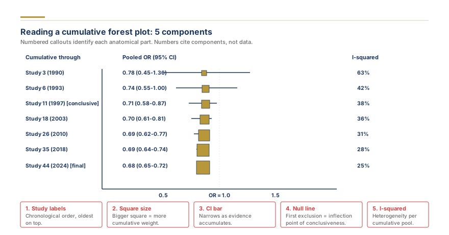
Open the free forest plot maker and navigate to the Cumulative tab. Enter your study data with publication years included as a column. The tool will automatically sort by year and render the sequential plot.
The left axis lists studies in chronological order from earliest (top) to most recent (bottom). Each row shows the pooled estimate calculated using all studies up to and including that row's study.
The diamonds get progressively narrower as you move down the plot, because more studies mean more precision. If a diamond is unexpectedly wide compared to those above and below it, that often indicates the newly added study had unusually high within-study variance or was from a very different population.
The vertical reference line marks the null effect. Watch for the moment in the sequence when the entire diamond moves to one side of the null and stays there. That is the point at which cumulative evidence crossed the threshold of statistical significance.
Interpreting drift. If the first three diamonds are all to the right of the null (favoring treatment) but the final five diamonds progressively shift left toward the null, consider running Egger's test using the Funnel Plot Generator to test for small-study effects. Drift is not definitive proof of bias, but it warrants investigation.