Robvis requires R and coding knowledge that most researchers do not have. This guide shows you how to create identical stacked bar summary charts and traffic light plots using our free online tools, no installation required.
Dr. Sarah Mitchell
April 16, 2026
Want to try this yourself? Use our free research tools, no sign-up required.
Key Takeaways
Use RoB 2 for all randomized controlled trials and the [Risk of Bias Tool](/resources/risk-of-bias-tool) to generate summary charts online.
Use ROBINS-I for non-randomized studies and the [ROBINS-I Tool](/resources/robins-i-tool) for the same chart output.
Never mix RoB 2 and ROBINS-I judgments in the same summary chart.
Complement bias assessment with GRADE to translate findings into evidence certainty statements.
Risk of bias assessment is a mandatory step in any systematic review or meta-analysis, and the summary visualization is one of the most scrutinized figures in your manuscript. The standard tool for generating these charts is robvis, an R package developed by McGuinness and Higgins (2021). The problem: robvis requires R, RStudio, and comfort with command-line package installation, which excludes the majority of clinical researchers who have never written a line of code.
This guide shows you how to create identical robvis-style charts using our free online tools, with no installation and no code. You will also learn how to handle multi-tool reviews, QUADAS-2 assessments, color coding standards, export specifications, and common visualization mistakes that trigger reviewer criticism.
Traffic Light Plot vs Summary Bar Chart: When to Use Each
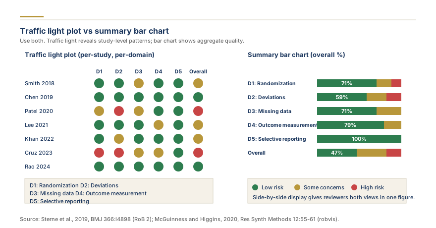
Traffic light plot vs summary bar chart
Every risk of bias visualization falls into one of two categories, and most published systematic reviews include both.
The traffic light plot shows every included study as a row, with colored circles in each domain column (green for low risk, yellow for some concerns, red for high risk). This chart is essential when your review includes fewer than 15 studies, because reviewers want to see exactly which studies carry weaknesses and in which domains.
The weighted summary bar chart aggregates judgments across all studies and shows the percentage in each risk category per domain as horizontal stacked bars. This is the primary figure for reviews with 15 or more studies, where a traffic light plot would become too tall to read.
When to use which. Reviews with 10 or fewer studies need the traffic light plot alone. For 10 to 20 studies, present both. For more than 20, lead with the bar chart and place the traffic light plot in supplementary files. Many journals following Cochrane Handbook guidance expect both regardless of study count.
How Robvis Works and Why Researchers Need Alternatives
Robvis is an R package that generates risk of bias visualizations from structured CSV data. To use it, you must install R, load the package, format your data with specific column conventions, and run plotting functions. The output is a ggplot2 figure exportable as PDF or PNG.
The quality of robvis output is excellent. The problem is accessibility. Fewer than 30% of health sciences researchers have working knowledge of R. Common failure points include package dependency conflicts, outdated R versions that break installation, and confusion about data formatting requirements.
Our free RoB 2 assessment tool produces charts visually identical to robvis output, using the same color scheme, layout conventions, and domain structures defined in Sterne et al. (2019) for Cochrane RoB 2. Everything happens in your browser: enter study names, click radio buttons for each domain judgment, and the chart renders instantly.
For researchers who do use R, our tools also generate downloadable R scripts that reproduce the exact same chart using robvis, giving you instant browser-based visualization for drafting plus a reproducible script for supplementary materials.
Step-by-Step Walkthrough Using Research Gold's Free RoB Tool
Here is the complete workflow for creating a risk of bias summary chart online using our free tool.
Step 1: Choose your assessment framework. Open the online RoB tool for randomized controlled trials assessed with Cochrane RoB 2, or open the ROBINS-I Tool for non-randomized studies.
Step 2: Add your studies. Click "Add Study" and enter the first author and year for each included study (for example, "Smith 2022"). The tool supports up to 50 studies per chart.
Step 3: Rate each domain. For each study, select the risk of bias judgment in every domain. For RoB 2, you will rate five domains: randomization process, deviations from intended interventions, missing outcome data, measurement of the outcome, and selection of the reported result. The tool automatically calculates the overall judgment following the algorithm in the RoB 2 guidance document.
Step 4: Review the auto-generated chart. As you enter judgments, the traffic light plot and summary bar chart update in real time.
Step 5: Download your charts. Click the export button to download both charts as high-resolution PNG files sized for direct manuscript insertion.
The entire process takes approximately 5 to 10 minutes for a review with 10 to 15 studies, compared to 30 to 60 minutes for the equivalent robvis workflow including setup time.
RoB 2 for Randomized Controlled Trials
The Cochrane RoB 2 tool, described in Sterne et al. (2019), evaluates five bias domains: randomization process, deviations from intended interventions, missing outcome data, measurement of the outcome, and selection of the reported result. Key thresholds include flagging studies with more than 20% missing outcome data, checking trial registries for outcome switching (D5), and noting that blinding matters most for subjective outcomes like pain scores (D4). For a deeper walkthrough of every signaling question, see our complete RoB 2 assessment guide.
ROBINS-I for Non-Randomized Studies
ROBINS-I assesses seven domains using a four-level scale: Low, Moderate, Serious, or Critical risk of bias. The framework covers confounding, selection of participants, classification of interventions, deviations from intended interventions, missing data, measurement of outcomes, and selection of reported results.
Open our online ROBINS-I tool and follow the same sequence: add studies, rate each domain, and download the summary chart. For the complete walkthrough, see our ROBINS-I assessment guide.
The most common error with ROBINS-I is conflating "moderate risk" with "some concerns" from RoB 2. In ROBINS-I, moderate risk is the expected baseline for well-conducted observational studies, because some confounding is inherent. "Low risk" in ROBINS-I is rare and indicates the study is comparable to a well-performed randomized trial.
Need expert quality assessment for your review?
Our methodologists conduct dual-reviewer risk of bias assessments, GRADE certainty ratings, and publication-ready summary tables.
If your systematic review evaluates diagnostic test accuracy, use QUADAS-2 (Quality Assessment of Diagnostic Accuracy Studies, version 2) instead of RoB 2 or ROBINS-I. QUADAS-2 assesses four domains: patient selection (consecutive vs convenience sampling), index test (blinded interpretation), reference standard (correct classification), and flow and timing (consistent application and appropriate interval). Uniquely, QUADAS-2 separates risk of bias from applicability concerns for the first three domains, and your summary chart should clearly distinguish both dimensions.
Matching Tool Choice to Study Design
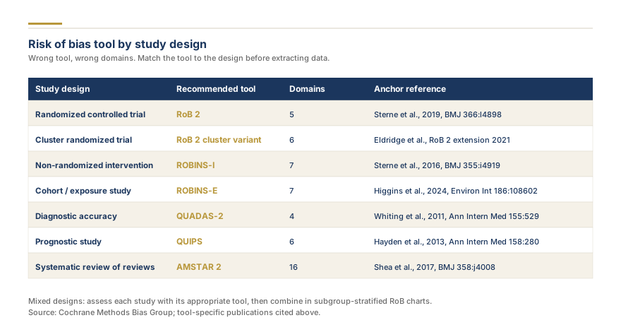
Risk of bias tool by study design
Selecting the wrong assessment tool is a frequent reason for desk rejection.
Study Design
Correct Tool
Randomized controlled trial
Cochrane RoB 2
Cluster or crossover randomized controlled trial
Cochrane RoB 2 (with design-specific considerations)
Cohort or case-control study
ROBINS-I
Diagnostic accuracy study
QUADAS-2
Observational without comparator
Newcastle-Ottawa Scale
If your review mixes randomized controlled trials and observational studies, run both tools separately. Never combine RoB 2 and ROBINS-I judgments in the same chart, because their rating scales are different and the visual comparison would be misleading. For observational studies without a comparator group, use our Newcastle-Ottawa Scale tool.
Multi-Tool RoB Charts: Combining Frameworks in One Review
When your review includes mixed study designs, you have three options. Separate charts per framework is the simplest: present one traffic light plot and one bar chart per tool, labeled clearly (for example, "Figure 2a: RCTs, Cochrane RoB 2. Figure 2b: Cohort studies, Newcastle-Ottawa Scale"). Unified composite figures place both charts as sub-figures. Harmonized overall ratings convert all tool-specific judgments to a three-level scale (low, moderate, high) for sensitivity analysis or GRADE, with conversion rules documented in supplementary materials. The critical rule is transparency: state which tool applies to which studies, and never blend domain-level judgments.
Need help with your risk of bias assessment? Our methodologists handle RoB 2, ROBINS-I, QUADAS-2, and Newcastle-Ottawa assessments as part of every complete systematic review service. If you want expert assessment alongside your review, get a custom project quote.
Color Coding Standards and What They Mean
The color coding in risk of bias charts follows conventions established by the Cochrane Collaboration and formalized in robvis.
Green means low risk of bias. Yellow maps to "some concerns" in RoB 2 or "moderate risk" in ROBINS-I (the expected baseline for observational research). Red indicates high, serious, or critical risk. White or gray means insufficient data to judge. If you customize colors, document the change in your figure legend. Most journals expect standard Cochrane colors.
Exporting Charts for Publication
Most journals require figures at 300 DPI minimum. Our tools export at 300 DPI by default in PNG format, which is accepted universally and keeps file sizes under 500 KB. For journals requesting 600 DPI, you can scale the PNG without quality loss because the charts use clean geometric shapes. Always include a figure legend stating the assessment tool, color key, and number of studies assessed. For reviews with more than 20 studies, place the traffic light plot in the supplementary appendix and keep only the bar chart in the main manuscript.
Common Mistakes in Risk of Bias Visualization
Peer reviewers flag these errors repeatedly. Mixing frameworks in one chart (RoB 2 three-level scale next to ROBINS-I four-level scale) creates misleading visuals. Omitting the overall judgment is another common error, since the overall rating feeds directly into GRADE and sensitivity analyses. Other frequent problems include non-standard colors without a legend, inconsistent domain ordering (RoB 2 should always follow D1 through D5 plus Overall), low-resolution exports below 300 DPI, missing studies that were included in the synthesis but absent from the chart, and overusing "no information" as a default rather than making a judgment from available evidence.
How Reviewers Evaluate RoB Charts During Peer Review
Reviewers check five things: completeness (every study present, every domain rated), calibration (consistent criteria application across studies), concordance with text (narrative matches the visual), tool appropriateness (correct framework for each study design), and GRADE integration (high bias leads to downgrading evidence certainty). If your text states "most studies were at low risk" but your chart shows mostly yellow and red, the contradiction will be flagged immediately. Complement your assessment with our free GRADE Evidence Tool, and read our complete guide to risk of bias in systematic reviews for the full quality assessment picture.
Worked Example: 8-Study RoB Table Walkthrough
Here is a worked example showing how eight fictional randomized controlled trials would be assessed using Cochrane RoB 2.
Study
D1: Randomization
D2: Deviations
D3: Missing Data
D4: Measurement
D5: Reporting
Overall
Ahmed 2021
Low
Low
Low
Low
Low
Low
Brown 2020
Low
Some concerns
Low
Low
Low
Some concerns
Chen 2022
Low
Low
High
Low
Low
High
Davis 2019
Some concerns
Low
Low
Some concerns
Low
Some concerns
Evans 2021
Low
Low
Low
Low
Low
Low
Farah 2020
Low
High
Low
High
Low
High
Garcia 2022
Low
Low
Low
Low
Some concerns
Some concerns
Hassan 2021
Low
Low
Low
Low
Low
Low
Interpreting this table. Three studies are at low overall risk, three have some concerns, and two are at high risk, translating to 37.5% low, 37.5% some concerns, and 25% high risk. The D2 (deviations) and D4 (measurement) domains are the main bias sources. A sensitivity analysis excluding the two high-risk studies would test whether removal changes the pooled estimate. In your results section, summarize these findings and reference the chart. To generate this exact visualization, enter the eight studies into our risk of bias visualizer.
Domain-by-Domain Assessment Tips
Document your reasoning with a one-sentence justification for every judgment. Reviewers frequently request this, and a structured rationale table in your supplementary materials saves revision time. Use the signaling questions in RoB 2 and ROBINS-I to arrive at each judgment systematically. Calibrate with your co-reviewer by assessing two or three pilot studies together before starting independently. Resolve disagreements through discussion or a third reviewer, and report the initial agreement rate (for example, Cohen's kappa) in your methods section.
Key Takeaways
Use Cochrane RoB 2 for all randomized controlled trials and the free risk of bias tool to generate summary charts online without installing R.
Use ROBINS-I for non-randomized studies and the ROBINS-I assessment tool for the same chart output.
Use QUADAS-2 for diagnostic accuracy studies, assessing patient selection, index test, reference standard, and flow and timing.
Present traffic light plots for smaller reviews and summary bar charts for larger ones, with both for reviews of moderate size.
Export charts at 300 DPI minimum in PNG format and verify resolution before journal submission.
Never mix frameworks in the same summary chart, and always label which tool was used.
Our tools generate downloadable PNG charts that meet journal standards, plus reproducible R scripts for supplementary materials.
Complement bias assessment with GRADE evidence assessment tool to translate findings into evidence certainty statements.
If you need expert risk of bias assessment as part of your review, explore our full-service systematic review or get a tailored quote.
To get every figure in your review built to journal standard, see our chart and figure design for traffic-light plots, forest plots, and more.
Frequently Asked Questions
5
A traffic light plot shows individual study ratings for each domain as colored symbols in a grid. A weighted bar chart aggregates all studies and shows the percentage rated Low, Some concerns, and High per domain as stacked bars.
Yes. The Newcastle-Ottawa Scale is widely used for cohort and case-control studies. ROBINS-I is more structured and aligns with Cochrane methodology. Our [Newcastle-Ottawa Scale](/resources/newcastle-ottawa-scale) tool generates NOS scores.
Yes. All major reporting guidelines require independent duplicate assessment with disagreements resolved by a third reviewer or consensus discussion.
Include them in your main analysis and conduct a sensitivity analysis excluding high-risk studies. If the pooled estimate changes substantially, note this in your GRADE assessment.
RoB 2 was developed by Cochrane's Risk of Bias Methods Group and is the current Cochrane standard for RCT assessment, replacing the original tool as of 2019. Need help with your systematic review or meta-analysis? [Get a free quote](/get-a-quote) from our team of PhD researchers.
Share
Found this useful? Share it with your colleagues.
Need expert quality assessment for your review?
Our methodologists conduct dual-reviewer risk of bias assessments, GRADE certainty ratings, and publication-ready summary tables.
Quality Assessment Takes Expertise. Our Team Does It Daily.
Rigorous risk of bias assessment, GRADE evaluations, and summary tables that satisfy peer reviewers. We handle the methodology so your review stands up to scrutiny.
Our promise: Free rework on synthesis or GRADE assessment if reviewers push back.
4.9 / 5Quote within a few hoursPRISMA 2020 + GRADE certaintyPhD methodologistConfidential by default
Dr. Sarah Mitchell holds a PhD in Biostatistics from Johns Hopkins Bloomberg School of Public Health and has over 15 years of experience in systematic review methodology and meta-analysis. She has authored or co-authored 40+ peer-reviewed publications in journals including the Journal of Clinical Epidemiology, BMC Medical Research Methodology, and Research Synthesis Methods. A former Cochrane Review Group statistician and current editorial board member of Systematic Reviews, Dr. Mitchell has supervised 200+ evidence synthesis projects across clinical medicine, public health, and social sciences.
Need professional help with your systematic review or meta-analysis? Get a free quote from our team of PhD researchers.
Quality Assessment Takes Expertise. Our Team Does It Daily.
Rigorous risk of bias assessment, GRADE evaluations, and summary tables that satisfy peer reviewers. We handle the methodology so your review stands up to scrutiny.
Meta-analysis in psychology pools the effect sizes from many studies into one reliable result. Learn the definition, real examples, and how researchers run one.
Human-written, AI-assisted, AI-screened: the labels have stopped being descriptive. Here is the single threshold journals actually use, what you must disclose, and where Research Gold draws the line.